
What Rebuilding My Productivity System Taught Me About Better Workflows
- Danny Devlin
- 1 day ago
- 16 min read

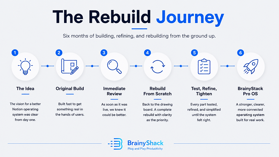
Six months of rebuilding BrainyStack Pro became a lesson in friction, clarity, and why better workflows usually come from removing complexity, not adding more.
When BrainyStack Pro first reached a working version, the obvious next step should have been simple: publish it, promote it, and move on to the next stage of the business.
The product worked. The structure was there. The main areas of solo work had a place: social media, content, projects, finance, analytics, clients, knowledge, assets, tasks, and planning. It was no longer an idea sitting in a private Notion workspace. It had become a real operating system with enough depth to support serious solo work.
But almost as soon as that first version was complete, I found myself going back into the system and rebuilding large parts of it.
Not because the original version was broken. That would have been easier to explain. It was rebuilt because the more I used it, the clearer it became that “working” and “finished” are not the same thing.
A productivity system can function correctly and still feel heavier than it needs to feel. It can have the right databases, the right relationships, and the right dashboards while still asking too much from the person using it. It can be technically complete but not yet clear enough on the surface. It can be powerful without being easy to trust.
That became the real focus of the rebuild.
At the beginning, I thought improvement would mean adding more. More views, more workflows, more templates, more clever structure, more proof that the system could handle complexity. By the end, the lesson was almost the opposite. The greatest improvements came from removing friction. They came from hiding what did not need to be visible, renaming what was not immediately clear, simplifying decisions, tightening the architecture, and making the system easier to understand without flattening what it could do.
That is a much less glamorous kind of product work, but it is probably the more important kind. A good productivity system is not measured by how much it contains. It is measured by how clearly it helps work move.
What This Rebuild Taught Me
A working operating system does not mean it is completed.
More features can make a system heavier, not better.
The real enemy is friction: the small pauses that make users stop and interpret the tool.
Complexity is not the problem. Poorly organised complexity is.
Dashboards should surface decisions, not prove how much the system can do.
Consistent structure makes a large workspace feel more trustworthy.
Good design often disappears into clearer labels, cleaner filters, and fewer unnecessary choices.
BrainyStack Pro stayed powerful under the hood. The rebuild made that power easier to use.
Functional Is Not the Same as Finished
One of the most useful distinctions I learned during the rebuild was the difference between a system that works and a system that feels finished.
A working system proves that the idea is possible. The databases connect. The records behave. The views display the right information. The pages lead somewhere. You can put real work into it and get real value out of it.
But a finished system needs to do more than function. It needs to reduce hesitation. It needs to make the next step easier to see. It needs to feel understandable even when the user has not spent months thinking about its structure.
That was the problem with the earlier version. Much of it made sense because I had built it. I understood why certain properties existed. I knew which views mattered most. I could remember the reasoning behind labels, formulas, module layouts, and dashboard decisions. But a user does not arrive with that hidden context.
The builder always has an unfair advantage. The user sees the surface.
That difference matters enormously in productivity design. If a workspace only makes sense because you remember the thinking behind it, the design has not done enough work yet. A serious operating system should not rely on the user decoding its history. It should explain itself through structure.
This is especially important in Notion because Notion makes complexity easy to create. You can build almost anything if you are willing to keep adding databases, relations, rollups, formulas, filtered views, templates, buttons, linked databases, dashboards, and pages. The danger is that every addition feels justified in isolation. Each one solves a small problem.
Each one gives the system a little more power. Then, gradually, the system becomes harder to use.
Not because any single decision was obviously wrong, but because the total experience becomes too demanding. You open a page and see too many options. You open a record and see too many properties. You look for the right place to add something and pause. You know the system can do what you need, but you have to think before using it.
That pause is the problem.
The rebuild became an attempt to remove as many of those pauses as possible.
The Productivity Workflow Mistake: Asking What Else It Can Do
When you are improving a productivity system, the most tempting question is: what else can this do?
It is an understandable question. It feels ambitious. It feels like value. A product with more dashboards, more templates, more views, and more advanced logic can look more complete. It is easier to explain improvement when you can point to new things.
But feature count is a poor measure of usefulness.
The better question is: what is making this harder to use than it needs to be?
That question changes everything. It moves the focus away from expansion and towards friction. It forces you to look at the tiny moments where a system slows the user down. Not the obvious failures, but the small hesitations: a label that is technically accurate but not intuitive, a dashboard that shows more than it should, three views that solve nearly the same problem, a property that is visible even though it rarely helps the user make a decision.
None of those issues feel dramatic on their own. But productivity systems are made of small interactions. Every unnecessary decision costs attention. Every unclear label creates a little doubt. Every extra view asks the user to interpret the system before doing the work.
That is the opposite of what a good operating system should do.
A serious solo operator already has enough to think about. Content, clients, projects, revenue, delivery, planning, admin, learning, and strategy all compete for attention. The system should not become another thing that needs managing. It should make the work easier to orient.
That does not mean a system should be simplistic. Minimalism can become just as performative as complexity. Some work genuinely needs structure, especially when one person is managing several areas of a business alone.
The aim is not to remove complexity entirely. The aim is to organise it so the user does not feel all of it at once. A good system should have depth where the work requires it, while keeping that depth organised enough that the user does not have to fight through it every time they open the workspace.
What Actually Changed
A rebuild is easy to explain badly. The lazy version is to list everything that changed: the dashboards, views, properties, formulas, workflows, signals, layouts, and navigation improvements. Those things matter, but they are not the point.
The more important changes were philosophical.
The system became clearer about where work begins. That sounds simple, but it is one of the most common weaknesses in productivity systems. Many workspaces are built as storage environments rather than operating environments. They give everything a place, but they do not make it obvious where to start.
Storage is useful, but work needs movement.
If you open a system and immediately have to decide whether you are capturing, planning, reviewing, executing, organising, analysing, or archiving, the system is already asking for energy. A good operating layer should provide sensible entry points. It should help the user begin without re-orienting themselves every time.
The rebuild also made the system clearer about what needs attention. This became one of the most important design themes. In a connected workspace, not everything deserves equal visibility. Some records are active. Some are waiting. Some are finished. Some are reference material. Some need action soon. Some simply need to exist quietly in the background.
When all of that is displayed with the same visual weight, the system becomes noisy.
So the rebuild placed more emphasis on filtered views, cleaner statuses, better signals, and dashboards that show the right level of information. The goal was not to make the system look clever. It was to make attention easier to direct.
This is one of the most important distinctions in productivity design: a database can store everything, but a dashboard should not show everything.
The database is the warehouse. The dashboard is the decision surface.
Confusing those two roles creates clutter. Separating them creates clarity.
Consistency became another major focus. This is not exciting work, but it matters more than people realise. When similar parts of a system behave differently, users have to keep translating. A content record, project record, client record, revenue item, expense, task, and knowledge item do not need to be identical, but they should feel like they belong to the same operating environment.
The more consistent the system became, the easier it was to trust the depth of it.
Consistency reduces the feeling that every page has its own rules. It allows the user to learn once and apply that understanding across the workspace. Over time, that creates confidence. The system stops feeling like a collection of clever parts and starts feeling like one designed whole.
The Invisible Work Is Often the Real Work
Some of the most valuable improvements from the rebuild would be almost invisible to someone scanning the finished product.
Renaming a property does not sound dramatic. Deleting a view does not sound like progress. Hiding a field will never make an exciting product announcement. Standardising a signal formula is not the kind of thing most users will consciously notice.
But these small decisions often create the biggest improvement in daily use.
A productivity system has a surface and a structure. The surface is what the user sees:
pages, dashboards, views, labels, buttons, icons, and layouts. The structure is what makes the surface trustworthy: relationships, filters, defaults, formulas, naming conventions, status logic, and the decisions about what should not be visible.
When the structure is messy, the surface eventually becomes messy too.
A lot of the rebuild happened in that hidden layer. It was less about adding obvious new capabilities and more about making the existing system easier to rely on. Some fields were hidden because they were useful for the system but not useful for the user in that moment.
Some views were removed because they created choice without adding clarity. Some terms were changed because accurate language is not always the same as usable language.
That last point became surprisingly important.
The words inside a system shape how people understand the work. A property name might be technically correct, but if it makes the user pause, it is probably not doing its job. A status should not require interpretation. A signal should not feel mysterious. A dashboard title should make the purpose of the view obvious.
Good terminology reduces explanation.
That kind of work is easy to dismiss because it feels minor. But minor does not mean unimportant. In a system used repeatedly, small points of confusion compound. A confusing label seen once is an irritation. A confusing label seen every day becomes a tax on attention.
The best design often disappears. A clear filter disappears because it simply shows the right records. A good default disappears because the user does not have to think about it. A sensible dashboard disappears because it feels obvious. That does not mean the design is absent. It means the design is doing its job.
Deleting Ideas Is Part of Building
One of the harder lessons of the rebuild was accepting that a good idea can still be the wrong idea for the system.
This happened repeatedly. Some ideas were genuinely useful. Some were clever. Some would have looked good in a walkthrough. Some made sense as standalone features. But once they were placed inside the wider architecture, they added weight.
That became the test. Not whether the idea was good, but whether it made the system better.
Those are different standards.
A feature can be impressive and still weaken the experience. A view can support an edge case but not deserve permanent space. A property can be useful occasionally while making every record feel heavier. A workflow can be technically complete but too slow for real use.
Building requires addition, but refining requires judgement. At a certain point, the work is no longer about asking what could be added. It is about deciding what deserves to remain.
That is uncomfortable because every removal feels like a small loss. You remember why you added the thing. You remember the problem it was supposed to solve. You can imagine a situation where someone might use it. But a productivity system cannot be designed around every possible situation with equal priority.
Every visible element is a recommendation. Every dashboard says, “look here.” Every property says, “this matters.” Every status says, “think about the work this way.”
If too many things matter, the system loses its sense of priority.
Deleting is not the opposite of building. It is part of building. It is how the system becomes more intentional.
The final version is not simply the result of what was added.
It is also the result of what was refused.
The Difference Between a Second Brain and an Operating System
The rebuild also clarified the difference between a second brain and an operating system.
A second brain is usually designed around capture, memory, reference, and retrieval. It helps you store ideas, notes, resources, highlights, lessons, and useful information. That is valuable, especially for knowledge work.
But an operating system has a different responsibility. It has to help work move.
It needs to support decisions, deadlines, commitments, publishing, delivery, revenue, review, and action. It cannot only be a library. It has to create momentum.
This distinction affected the rebuild in practical ways. Knowledge matters, but it should not overwhelm execution. Planning matters, but it should not become a place to hide from delivery. Analytics matter, but they should not become decorative charts detached from decisions. Content ideas matter, but they need a route from capture to draft to publication to review.
A personal operating system needs memory, but it also needs movement.
That means the key design questions are different. The question is not only “where do I store this?” It is also “what happens next?” Where does an idea go when it becomes content? Where does a project show up when it becomes urgent? Where does a client commitment appear so it does not get lost? Where does a revenue item become something to follow up? Where does a metric become evidence rather than trivia?
Those are workflow questions, not storage questions.
Many productivity systems fail because they are built as collections of places. A place for notes. A place for tasks. A place for projects, resources, goals, ideas.
Places are useful, but they are not enough.
Work needs routes.
The rebuild became much stronger once that distinction was clear. The system did not need to become a bigger library. It needed to become a better operating layer.
Usability Is Not Decoration
Earlier in the process, it was tempting to think of usability as something that could be polished at the end. Build the structure first, then make it nicer later.
There is some truth in that. You cannot refine what does not exist, and a rough working system is better than an imaginary perfect one. But usability is not decoration. It is not just icons, banners, spacing, page layout, or visual polish.
Usability is whether the system can be understood under real working conditions.
That means when the user is tired. When they only have fifteen minutes. When they are switching between client work, content, admin, and planning. When they have not opened a module in a week. When they are trying to find something quickly. When they are not in “system building mode” and simply need to do the work.
That is the real test.
A system can look excellent in a calm walkthrough and still be awkward in daily use. It can make sense when explained by its creator and still be unclear when used alone. It can look impressive in screenshots while creating too much interpretation in practice.
During the rebuild, I started judging the system less by whether each section was technically complete and more by whether it was kind to the user.
Not soft. Not simplistic. Kind.
A kind system respects the user’s attention. It does not make them interpret unnecessary information. It does not show complexity before it is needed. It does not turn every record into a form-filling exercise. It does not assume the user remembers how everything works.
This became a useful design standard because it forced the system to be judged from the user’s side rather than the builder’s side.
That is where better usability comes from. Not from asking whether the system is impressive, but from asking whether it helps.
Architecture Protects the User From the System
The word “architecture” can sound excessive for a Notion workspace, but it is the right word.
Architecture is not about making something complicated. It is about deciding how parts relate to each other so the whole thing remains usable as it grows.
Without architecture, systems grow by impulse. You add a database because you need somewhere to store something. You add a dashboard because the database becomes hard to read. You add a relation because two things need to connect. You add a formula because you want a signal. You add a new view because a particular situation keeps coming up.
Each decision may be reasonable. The problem is the accumulation.
A system can become messy through a series of sensible choices.
That is why architecture matters. It creates boundaries. It decides what each part of the system is responsible for. It prevents the content system from becoming the project system.
It prevents analytics from becoming a decorative reporting area with no operational purpose. It prevents knowledge from swallowing execution. It prevents tasks from spreading everywhere.
Good architecture protects the user from the system’s own complexity.
This is especially important for solo operators because their work is rarely neatly separated. A content idea might become a project. A project might involve a client. A client might create revenue. Revenue might connect to delivery. Delivery might produce lessons. Lessons might become future content. Everything touches everything else.
A connected system needs to reflect that without becoming tangled.
The answer is not to isolate everything. The answer is to connect things deliberately.
When architecture is weak, users create workarounds. They keep side lists. They duplicate information. They start using random notes again. They stop trusting the system as the central place for work.
That is usually how productivity systems fail. Not suddenly, but quietly. They become slightly less trusted each week until they are no longer the operating layer.

Better Systems Make Their Complexity Easier to Carry
One of the strongest outcomes of the rebuild was that BrainyStack Pro became more capable without forcing the user to feel the full weight of that capability at every moment.
That is what a mature operating system should do. It should contain serious structure without making every part of that structure compete for attention at once.
The underlying architecture can be powerful. It can connect multiple areas of work and support serious operations. But the user should not have to confront the full depth of that architecture every time they open the workspace.
A good system reveals itself in layers. At the top level, it should make orientation easy. When more detail is needed, the detail should be available. When it is not needed, it should stay out of the way.
This is why dashboard design matters. Not because dashboards are impressive, but because they decide what rises to the surface. A poor dashboard is just a database arranged nicely. A useful dashboard is a decision surface. It helps the user see what is active, what needs attention, what is scheduled, what is stuck, and where to go next.
The rebuild made me much less interested in showing everything the system could do and much more interested in showing what the user needs at a given moment.
That shift applies beyond Notion.
Good products often make their complexity easier to carry. Good writing feels simpler than the thinking behind it. Good operations feel calmer than the effort required to design them. The better the architecture, the less the user has to manually interpret the system before they can use it.
That is not a lack of depth. It is controlled depth.
Shipping Is Not Always the Finish Line
There is a common idea in product work that shipping is the goal. In many ways, it is. A real product in the world is better than a perfect product trapped in private development.
Shipping creates pressure, discipline, and contact with reality. But shipping is not always the finish line. Sometimes shipping is the first honest test.
Before something is shipped, it is easy to judge it by intention. After it is shipped, you start judging it by use. You notice what feels strong. You notice what feels awkward. You notice which parts take too long to explain. You notice what you avoid using. You notice where the product technically works but does not yet feel as clear as it should.
That is what happened with BrainyStack Pro.
The first working version proved that the idea was real. The rebuild made the product more trustworthy.
That distinction matters because it changes how you think about creative work. You do not need to wait until something is perfect before making it real, but you also do not need to pretend the first real version is the final version.
There is a middle ground: ship seriously, then improve honestly.
The danger is using iteration as an excuse for weak work. The opposite danger is using quality as an excuse to never publish. A good product culture needs both standards. It needs the courage to release and the humility to keep refining.
The rebuild was not a sign that the first version had failed. It was evidence that the product had become real enough to judge properly.
The Broader Lesson
Although this article comes from rebuilding a Notion productivity system, the lesson applies much more broadly. Most things improve when friction is removed.
A website improves when the next step is clearer. A product improves when the user does not need to decode it. A business improves when operations are easier to trust. A workflow improves when handoffs are obvious. A dashboard improves when it stops trying to impress and starts helping decisions. A piece of writing improves when unnecessary words disappear.
This is not the most exciting version of improvement. It does not always create dramatic before-and-after screenshots. It is not as easy to announce as a new feature, new module, or new design. But it is often where the quality is.
Complexity is easy to create because it comes from enthusiasm. You care about the thing, so you add more to it. More ideas, more options, more edge cases, more proof that you thought about everything.
Simplicity requires a different kind of confidence.
It asks you to decide what matters. It asks you to remove what does not serve the core experience. It asks you to trust the shape of the thing instead of protecting every possible addition.
That is uncomfortable, but it is necessary. The user does not experience your intentions. They experience the finished surface. They experience whether the system helps them think clearly, move work forward, and trust what they are looking at.
That is the standard that matters.

What Comes Next
The intense rebuild phase is now over.
That does not mean BrainyStack Pro will never change again. Any serious product should keep learning from real use. But the architectural rebuild has done what it needed to do. The system is clearer, more coherent, and more intentional than it was before.
The next phase is about showing the thinking behind it.
That means publishing more about productivity systems, workflow design, Notion workspaces, solo operations, and the practical decisions that make a workspace easier to trust. Not as abstract productivity theory, and not as a constant product pitch, but as useful thinking for people trying to build better systems for their own work.
That feels like the right next step because the thinking behind a system matters as much as the system itself.
Tools are everywhere. Templates are everywhere. Dashboards are everywhere.
What is rarer is a calm approach to how work should actually move.
That is what BrainyShack will keep exploring: not productivity as performance, not organisation as decoration, and not systems for the sake of systems, but practical operating structures that help serious solo workers think clearly, execute consistently, and trust the way their work is organised.
A better productivity system is not always the one with more inside it. It is the one that organises its complexity well enough for the work to become clearer.
That is the biggest lesson I take from the rebuild.
Comments